Consistent and Clean Layout
A consistent and clean layout is essential for creating an effective and visually appealing website. It helps visitors navigate effortlessly, find information quickly, and enjoy a seamless browsing experience. By maintaining uniform design elements and a clutter-free appearance, websites can establish professionalism and trust, making it easier to engage and retain users.
Use of Grid Systems
Consistent and clean layout combined with the effective use of grid systems are essential elements of good website design examples. They help create a visually appealing and user-friendly interface that enhances the overall user experience. By organizing content logically and maintaining uniformity across pages, designers can ensure visitors easily find information and navigate the site seamlessly.
- Grid systems provide a structured framework that aligns elements precisely, ensuring visual harmony and balance.
- Using grids makes it simpler to maintain consistency in spacing, sizing, and positioning of content blocks throughout the website.
- Responsive grid layouts adapt smoothly to different screen sizes, improving accessibility and usability on devices of all kinds.
- A clean layout avoids clutter by prioritizing essential content and utilizing ample whitespace, which guides the user’s attention effectively.
- Consistency in design elements such as fonts, colors, and navigation creates a cohesive look that reinforces brand identity and builds trust.
Clear Hierarchy of Content
Good website design examples showcase the importance of a consistent and clean layout combined with a clear hierarchy of content. A well-structured layout ensures that visitors can easily navigate the site without feeling overwhelmed or confused, making their experience more enjoyable and efficient. Maintaining visual consistency through uniform fonts, colors, and spacing reinforces brand identity and helps users recognize patterns effortlessly. Additionally, a clear hierarchy of content guides visitors’ attention to the most important elements first, such as headlines, calls to action, and key information, enabling them to find what they need quickly. Overall, these design principles contribute to a professional, user-friendly website that effectively communicates its message and encourages engagement.
Balanced whitespace
Effective website design exemplifies the importance of maintaining a consistent and clean layout, which enhances user experience and readability. A well-structured layout guides visitors seamlessly through the content, making navigation intuitive and enjoyable. Clean design avoids clutter by organizing elements thoughtfully, allowing key information to stand out without overwhelming the audience. Balanced whitespace, or negative space, plays a crucial role in this approach by providing breathing room around text, images, and other elements. It improves visual clarity, emphasizes important features, and creates a sense of harmony across the page. Good website design leverages these principles to establish a professional appearance, foster user engagement, and communicate messages efficiently.
Effective Navigation
Effective navigation is a crucial element of good website design, guiding users seamlessly through content and enhancing their overall experience. When a website features intuitive menus, clear labels, and logically organized pages, visitors can find what they need quickly and efficiently. Strong navigation not only improves usability but also encourages longer visits and higher engagement, making it a key factor to consider when showcasing excellent website design examples.
Intuitive Menu Placement
Effective navigation and intuitive menu placement are essential components of good website design, guiding users seamlessly through content and enhancing overall user experience. An well-structured menu should be easily accessible, usually located in familiar areas such as the top header or sidebars, ensuring visitors can find important sections effortlessly. Clear labeling of menu items helps users understand where they will be directed, reducing confusion and frustration. Utilizing dropdown menus, icons, and visual cues can further support intuitive navigation, allowing users to explore the website efficiently. Good examples demonstrate consistent placement across pages, minimal clutter, and responsiveness on various devices, all contributing to a smooth and engaging browsing experience.
Sticky Navigation Bars
Effective navigation is a crucial element of good website design, ensuring users can easily find their way around and access desired content effortlessly. Sticky navigation bars are a popular feature that enhance usability by remaining visible as users scroll through a page, providing instant access to important links at all times.
- Sticky Navigation Bars Improve User Experience: They reduce the number of steps needed to navigate, making browsing more seamless and intuitive.
- Easy Accessibility: Important links, such as contact information, menus, or search bars, remain constantly accessible without having to scroll back to the top.
- Enhanced Website Aesthetics: When designed thoughtfully, sticky navigation bars complement the overall look of the website without cluttering the interface.
- Consistent Navigation Experience: They help maintain a consistent user journey, especially on content-rich sites where visitors need quick access to various sections.
- Best Practices for Implementation:
- Keep the sticky navigation simple and uncluttered.
- Ensure it does not overlay or interfere with content visibility.
- Optimize for mobile devices to ensure responsiveness.
- Use smooth transition effects to enhance visual appeal.
Simple and Descriptive Labels
Effective navigation is essential for a positive user experience on a website. Clear and intuitive menus allow visitors to find information quickly without frustration, increasing engagement and reducing bounce rates. Simple and descriptive labels for navigation links help users understand where each link will take them, guiding them smoothly through the site’s content. Well-designed navigation combined with straightforward labels ensures that visitors can access what they need effortlessly, making the website more user-friendly and improving overall usability.
Responsive and Mobile-Friendly Design
Responsive and mobile-friendly design are essential elements of modern website development, ensuring that sites look and function well on all devices, from desktops to smartphones. These designs adapt seamlessly to different screen sizes and resolutions, providing users with a smooth and engaging experience regardless of how they access the website. Incorporating responsive principles is crucial for creating effective and user-centered websites that meet contemporary expectations.
Flexible Layouts
Responsive and mobile-friendly design, along with flexible layouts, are essential elements of good website design examples. These approaches ensure that websites adapt seamlessly to different screen sizes and devices, providing users with an optimal viewing experience. Responsive design uses fluid grids, flexible images, and media queries to adjust content layout based on the device’s screen size. This flexibility enhances usability and accessibility, making websites more user-centric. Implementing these strategies helps create visually appealing and functional websites that maintain their integrity across desktops, tablets, and smartphones, setting a standard for excellent website design examples.
Touch-Friendly Elements
Responsive and mobile-friendly design are essential components of good website design, ensuring that websites adapt seamlessly to various screen sizes and devices. A responsive layout adjusts content and images to fit desktops, tablets, and smartphones, providing a consistent user experience. Mobile-friendly design emphasizes simplicity, readability, and easy navigation on smaller screens, which is crucial as more users access websites via mobile devices. Touch-friendly elements, such as large buttons, spaced links, and swipeable galleries, enhance usability by making interactions smooth and intuitive on touchscreens. Incorporating these features into website design not only improves user satisfaction but also boosts search engine rankings, making them key examples of effective website design.”
Fast Loading Times
Effective website design examples showcase the importance of being responsive and mobile-friendly, ensuring that content adapts seamlessly to various screen sizes and devices. This approach enhances user experience by providing easy navigation and readability whether on a smartphone, tablet, or desktop. Additionally, fast loading times are a crucial aspect of good web design, as they reduce user frustration and decrease bounce rates. Optimizing images, leveraging browser caching, and minimizing code can significantly improve page speed, making websites more efficient and engaging for visitors.
Visual Appeal and Branding
Visual appeal and branding are essential elements in creating an effective website that captures attention and leaves a lasting impression. A well-designed website not only attracts visitors but also reinforces the brand’s identity, values, and personality. When these elements are harmoniously integrated, they enhance user experience and build trust, making the website a powerful tool for engagement and conversion.
Consistent Color Scheme
Consistent color schemes play a crucial role in creating visually appealing and memorable website designs. They help establish brand identity and ensure a harmonious user experience. When colors are thoughtfully chosen and consistently applied across all pages and elements, it reinforces the brand message and makes the website more professional and trustworthy.
- Using a limited color palette helps maintain visual coherence and prevents clutter.
- Brand colors should be prominent enough to reinforce recognition but not overpower content.
- Contrasting colors improve readability and highlight important calls to action.
- Consistency in color application across headers, buttons, and backgrounds creates a unified look.
- Well-chosen colors evoke specific emotions and can influence user behavior positively.
High-Quality Images
Effective website design examples often showcase the power of visual appeal and branding through the use of high-quality images. These images help establish a strong visual identity, make the site more engaging, and convey professionalism and trustworthiness. Carefully chosen visuals can highlight products, services, or brand values, creating an emotional connection with visitors. Consistent branding elements combined with crisp, well-composed images ensure the website looks polished and memorable, encouraging visitors to explore further and leaving a lasting impression.
Engaging Typography
Engaging typography plays a crucial role in enhancing the visual appeal and branding of a website. Thoughtfully chosen fonts and styles create a distinctive identity, making content more memorable and accessible. Effective typography guides the viewer’s eye, emphasizing key messages and encouraging interaction. When paired with a cohesive color scheme and layout, it elevates the overall aesthetic, showcasing professionalism and creativity. Good website design examples often feature bold, readable headings alongside clear body text, striking a balance that captures attention while maintaining user-friendliness. Ultimately, audience engagement and brand recognition are strengthened through careful attention to typography that aligns with the site’s purpose and identity.
Content Prioritization
Effective content prioritization is a crucial element of good website design, ensuring that visitors can easily find and focus on the most important information. By strategically arranging content, designers can guide users through a seamless browsing experience and improve engagement. In this article, we will explore exemplary website design examples that demonstrate how thoughtful content prioritization enhances usability and overall aesthetic appeal.
Clear Call-to-Action Buttons
Effective website design relies heavily on content prioritization to guide visitors seamlessly through the most important information. Organizing content in a way that highlights key messages ensures users quickly find what they need, enhancing their overall experience. Clear call-to-action buttons are essential in directing user behavior, providing straightforward and visually distinct options that encourage engagement or conversions. Well-designed CTA buttons stand out from the rest of the page, making it easy for visitors to take desired actions such as signing up, purchasing, or learning more. Together, these elements create a user-friendly interface that improves navigation and achieves website goals efficiently.
Highlighting Key Information
Effective content prioritization is essential in creating good website designs, as it helps guide visitors’ attention to the most important information first. Highlighting key details ensures that users quickly find what they need, improving overall user experience and engagement.
- Identify the main goals of the website and focus on displaying content that aligns with these objectives.
- Use visual hierarchy techniques such as size, color, and placement to emphasize crucial elements like calls-to-action or major features.
- Break content into digestible sections with clear headings to facilitate easy scanning by users.
- Limit clutter by removing unnecessary information, ensuring that only the essential content is prominently showcased.
- Implement contrasting colors and bold fonts to draw attention to key messages or offers.
Good website design examples often showcase how effective content prioritization and highlighting of key information can create intuitive and visually appealing layouts that enhance user interactions.
Use of Visual Hierarchy
Effective website design begins with clear content prioritization and the strategic use of visual hierarchy to guide visitors through information seamlessly. By emphasizing the most important elements, such as headlines, calls to action, and key messages, designers ensure users can quickly find what they need and understand the site’s purpose. Visual hierarchy is achieved through contrasting sizes, colors, spacing, and positioning, which create a natural flow that directs attention and enhances user experience. Good website design examples often showcase a balanced and intuitive arrangement of content, making navigation effortless and engaging for visitors.
User Engagement and Accessibility
User engagement and accessibility are essential components of effective website design. A website that encourages user interaction while being accessible to everyone creates a more inclusive and engaging online experience. By prioritizing these elements, designers can ensure that all users, regardless of their abilities or devices, can navigate and enjoy the website seamlessly. Good website design examples often showcase thoughtful strategies that balance aesthetic appeal with functional accessibility, fostering higher user satisfaction and loyalty.
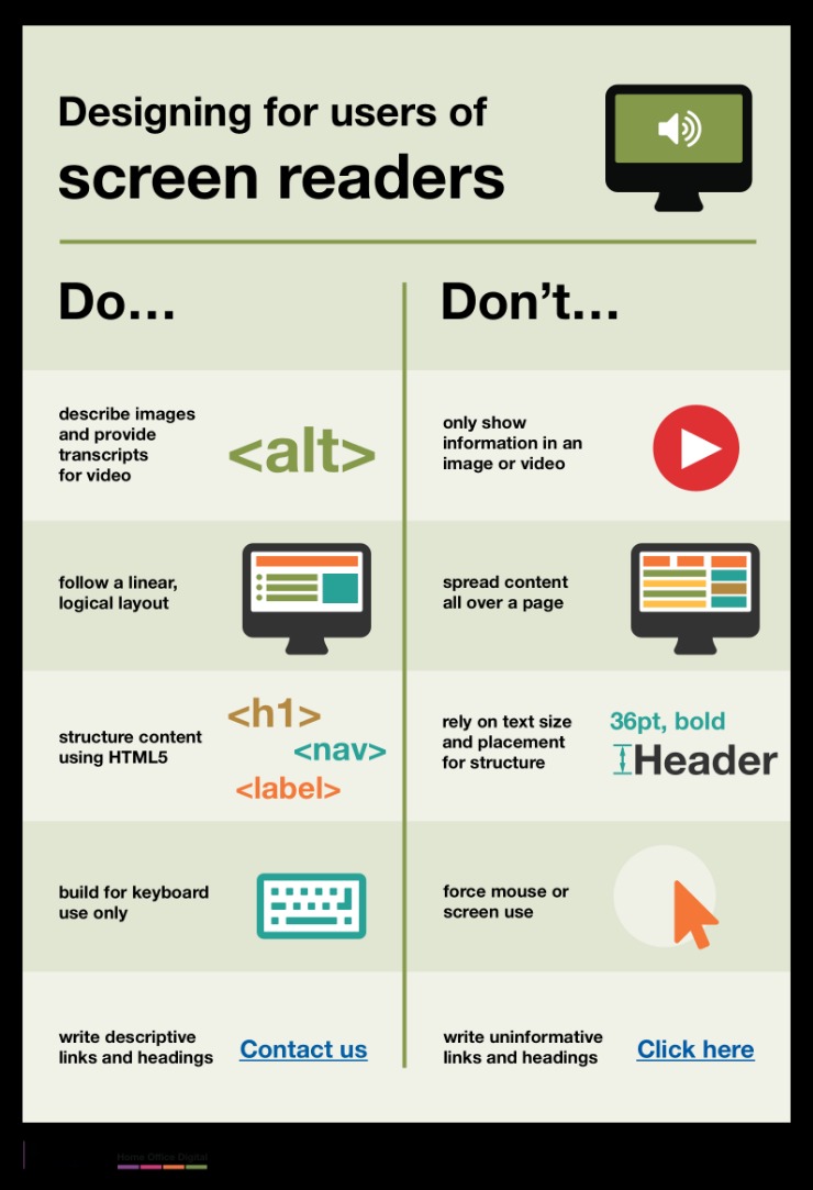
Accessible Design Features
In creating effective website designs, prioritizing user engagement and accessibility is essential to reach a broader audience and provide an inclusive experience. Accessible design features ensure that all users, regardless of their abilities or devices, can easily navigate and interact with the website content.
- Clear and Consistent Navigation: Simplifies user journeys, making it easy for visitors to find information and engage with content.
- Alternative Text for Images: Assists users who rely on screen readers by providing descriptive text for visual elements.
- Keyboard Accessibility: Enables users to navigate the site using keyboard commands alone, enhancing usability for those with mobility impairments.
- High Contrast and Readable Fonts: Improves visibility and readability for users with visual impairments or low vision.
- Responsive Design: Ensures the website functions well across various devices and screen sizes, promoting accessibility and engagement.
- Accessible Forms: Includes labels, instructions, and error messages that are easy to understand and interact with.
- Use of ARIA Labels and Roles: Provides additional context to assistive technologies, making complex interactive elements accessible.
Implementing these accessible design features not only demonstrates good website design practices but also enhances user engagement by making content more inclusive and easier to use for everyone.
Interactive Elements
Effective website design prioritizes user engagement and accessibility by incorporating interactive elements that invite users to participate actively. Features such as clickable buttons, hover effects, dropdown menus, and media sliders can enhance the user experience, making navigation intuitive and enjoyable. Additionally, accessible design ensures that all users, including those with disabilities, can interact with the website comfortably through features like keyboard navigation, screen reader compatibility, and clear visual contrasts. Combining engaging interactive elements with accessibility considerations results in websites that are both appealing and inclusive, setting excellent examples of thoughtful design.
Inclusive Color Choices
Effective website design prioritizes user engagement and accessibility to create inclusive experiences for all visitors. Incorporating accessible features ensures that users with varying abilities can navigate and interact with content comfortably. Inclusive color choices play a crucial role by providing sufficient contrast and selecting color palettes that are friendly to color-blind users, enhancing readability and comprehension. Good design examples demonstrate a thoughtful balance between aesthetic appeal and functional accessibility, encouraging prolonged engagement and positive user interactions across diverse audiences.

