Understanding the Fundamentals of Graphic Design in Website Development
Understanding the fundamentals of graphic design is essential for creating visually appealing and effective websites. In website development, strong graphic design principles help enhance user experience, communicate brand identity, and establish a cohesive visual harmony. By mastering elements such as color theory, typography, layout, and imagery, designers can craft websites that are both functional and aesthetically engaging.
Principles of Effective Visual Communication
Understanding the fundamentals of graphic design is crucial for creating visually appealing and functional websites. It helps designers communicate messages clearly and attractively, ensuring that users have a positive experience. Effective visual communication in website design involves combining various elements such as color, typography, layout, and imagery to convey information and guide user behavior seamlessly.
- Color theory plays a vital role in setting mood, emphasizing important elements, and establishing brand identity.
- Typography enhances readability and helps establish a hierarchy of information, making content easier to navigate.
- Layout and composition organize content logically, directing attention to key areas and improving overall usability.
- Consistent visual style creates a cohesive appearance that reinforces brand recognition.
- Use of imagery and graphics supports message delivery and adds visual interest to the website.
Following these principles ensures that a website not only looks attractive but also communicates effectively, encouraging user engagement and achieving design goals efficiently.
Color Theory and Palette Selection
Understanding the fundamentals of graphic design is essential in creating visually appealing and effective websites. A key aspect of this is mastering color theory and palette selection, which significantly influence user experience and brand identity.
Color theory involves understanding how colors interact, evoke emotions, and influence behavior. It helps designers choose harmonious color combinations that enhance readability and create desired moods. Proper color choices can guide visitors’ attention toward important elements and improve overall navigation.
Selecting an appropriate color palette involves considering the target audience, brand personality, and the psychological impact of colors. A well-balanced palette often includes primary, secondary, and accent colors to create visual interest without overwhelming the user.
- Identify the brand’s message and core values to determine the mood you want to convey through colors.
- Use color wheel principles, such as complementary, analogous, or triadic schemes, to find harmonious combinations.
- Limit the number of colors to maintain visual coherence and ensure accessibility for all users.
- Test colors for contrast to ensure readability and usability across different devices and lighting conditions.
- Incorporate neutral tones to balance bold colors and provide space for content.
Typography and Font Choices
Understanding the fundamentals of graphic design is essential for creating visually appealing and effective websites. A key aspect of this is typography and font choices, which play a crucial role in conveying the brand message and enhancing user experience. Good typography ensures readability, guides the user’s attention, and establishes a hierarchy that helps users navigate content seamlessly. Selecting the right fonts involves considering the website’s purpose, target audience, and overall aesthetic. Combining different font styles thoughtfully can add personality and visual interest, but it’s important to maintain consistency to avoid a cluttered appearance. Ultimately, mastering typography and font selection is vital for building websites that are not only aesthetically pleasing but also functional and user-friendly.
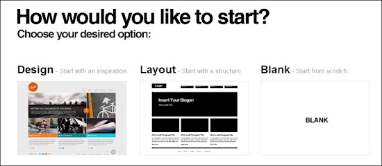
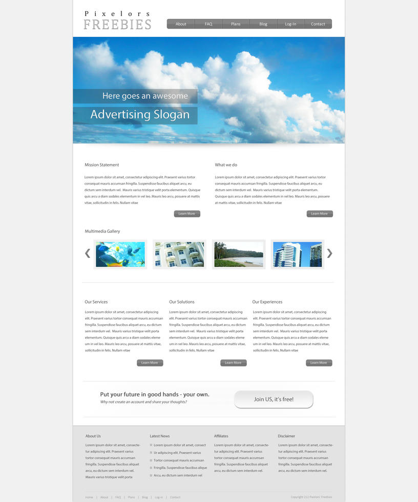
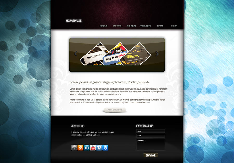
Layout and Composition
Understanding the fundamentals of graphic design is essential for creating visually appealing and effective websites. In website development, layout and composition serve as the foundation for guiding users through content seamlessly. A well-structured layout enhances readability, directs attention to key elements, and improves overall user experience. Composition involves the strategic placement of images, text, and other design elements to maintain balance, hierarchy, and visual interest. By mastering these principles, designers can craft websites that are not only aesthetically pleasing but also functional and user-friendly. Incorporating consistent design patterns, appropriate spacing, and a cohesive color scheme further strengthens the website’s visual identity and accessibility. Ultimately, a solid grasp of graphic design fundamentals allows for the creation of engaging, intuitive websites that communicate their message effectively to visitors.
Key Elements of a User-Friendly Website Design
Creating an effective graphic design website requires attention to key elements that enhance user experience and showcase creativity. A user-friendly design ensures visitors can easily navigate, find information, and appreciate the visual appeal. By focusing on clear layout, intuitive navigation, consistent branding, and responsive functionality, designers can craft websites that are both aesthetically pleasing and highly functional. These elements work together to attract, engage, and retain visitors, ultimately reflecting the professionalism and artistry of the graphic design brand.
Navigation Design and Structure
Creating a user-friendly website for a graphic design portfolio involves careful attention to navigation design and structure to ensure visitors can easily find and appreciate your work. Clear and consistent navigation menus help users move seamlessly through different sections of your website, such as portfolio galleries, about pages, and contact information. Organized content with logical hierarchy allows visitors to understand the flow of information without confusion. A clean layout with intuitive navigation features, such as dropdown menus or sticky headers, enhances usability. Additionally, responsive design is essential so that your website maintains its functionality and aesthetic appeal across various devices and screen sizes. Good font choices, ample white space, and visual cues guide users naturally through your site, making it simple for potential clients or collaborators to explore your creative projects. Ultimately, a well-structured, easy-to-navigate website fosters a positive user experience and effectively showcases your graphic design expertise.
Responsive Design for Various Devices
Creating a user-friendly website design is essential for engaging visitors and ensuring a positive browsing experience. Key elements include intuitive navigation, clear layout, fast loading times, and visually appealing graphics that complement the content. Incorporating consistent branding and easy-to-read typography also enhances usability. For graphic design websites, leveraging high-quality images and optimized visuals is crucial to showcase design skills effectively.
Responsive design for various devices is vital to accommodate users accessing the site from desktops, tablets, and smartphones. This involves designing flexible layouts that adjust seamlessly to different screen sizes. Using flexible grids, scalable images, and media queries ensures that content remains accessible and visually appealing regardless of device. Prioritizing mobile-first design approaches helps create a website that is functional and attractive across all platforms, ultimately expanding reach and improving user satisfaction.
Visual Hierarchy and Focus Points
In graphic design website design, creating a user-friendly experience hinges on establishing clear visual hierarchy and effective focus points. Visual hierarchy guides visitors through the content in a logical way, emphasizing the most important elements first. This can be achieved through the strategic use of size, color, contrast, and spacing to differentiate headings, images, and body text. Focus points draw attention to key actions or information, such as call-to-action buttons or featured projects, ensuring users know where to look and what to do next. Consistent and deliberate use of these elements enhances readability, navigation, and overall usability, making the website both appealing and functional for visitors.
Accessibility and Inclusivity
Creating a user-friendly graphic design website involves emphasizing accessibility and inclusivity to ensure all visitors can navigate and enjoy the site effectively. Clear and intuitive navigation structures help users find information easily, while a clean and visually appealing layout enhances engagement. Incorporating accessible features such as readable fonts, high contrast color schemes, and alternative text for images ensures content is accessible to users with visual impairments. Inclusivity also entails considering diverse user needs by providing adjustable font sizes, keyboard navigation, and accessible multimedia content. Overall, a well-designed website balances aesthetics with functionality to provide an inclusive experience that caters to everyone.
Tools and Technologies for Web Graphic Design
Tools and technologies for web graphic design play a crucial role in creating visually appealing and user-friendly websites. They enable designers to develop innovative layouts, enhance images, and implement dynamic elements that captivate visitors. Utilizing the right combination of software and development frameworks ensures that website designs are both functional and aesthetically engaging, ultimately contributing to a successful online presence.
Design Software (Adobe XD, Sketch, Figma)
Tools and technologies play a crucial role in web graphic design, enabling designers to create visually appealing and user-friendly websites. Among these tools, design software such as Adobe XD, Sketch, and Figma are widely regarded as industry standards for crafting wireframes, prototypes, and final UI designs. Adobe XD offers seamless integration with other Adobe Creative Cloud applications, making it ideal for detailed prototyping and collaboration. Sketch, primarily used on Mac, provides a user-friendly interface and efficient vector editing capabilities, streamlining the design process for web interfaces. Figma stands out as a cloud-based platform that facilitates real-time collaboration among team members, making it a popular choice for distributed teams working on website design projects. These tools support a range of functionalities including vector graphics, prototyping, and design systems, which are essential for creating cohesive and engaging web graphics. Mastery of these technologies allows designers to streamline their workflows, improve communication with developers, and produce high-quality websites that enhance user experience and visual appeal.
Web Development Languages (HTML, CSS, JavaScript)
Tools and technologies play a vital role in creating effective and visually appealing graphic design websites. Web development languages such as HTML, CSS, and JavaScript form the foundation of modern web design, enabling designers to build structured, styled, and interactive pages. HTML (Hypertext Markup Language) provides the basic structure and content of a website, allowing designers to organize text, images, and multimedia elements. CSS (Cascading Style Sheets) enhances the visual presentation by controlling layout, colors, fonts, and overall aesthetics, ensuring a cohesive and attractive design. JavaScript adds interactivity and dynamic features, allowing users to engage with the website through animations, form validations, and responsive components. Complementing these core languages are various tools like graphic design software (Adobe Photoshop, Illustrator, Canva), code editors (Visual Studio Code, Sublime Text), and frameworks such as Bootstrap or Tailwind CSS, which streamline the development process and help create responsive, user-friendly, and visually compelling websites. Together, these tools and technologies empower designers to craft innovative and effective web graphic designs that meet modern user expectations and branding standards.
Content Management Systems and Plugins
Tools and technologies for web graphic design, content management systems, and plugins are essential components in creating visually compelling and functional websites. Graphic design software such as Adobe Photoshop, Illustrator, and Sketch enable designers to craft custom visuals, logos, and layouts that enhance the website’s aesthetic appeal. For web-specific design, tools like Figma and Adobe XD facilitate collaborative interface design and prototyping. Content management systems (CMS) like WordPress, Joomla, and Drupal provide flexible platforms for managing and updating website content without requiring extensive coding knowledge. These CMSs often support a wide range of plugins and extensions that add functionalities such as SEO optimization, social media integration, and e-commerce capabilities. Popular plugins like Yoast SEO, WooCommerce, and Elementor empower website creators to customize their sites easily, improve user experience, and maintain consistent branding. Leveraging these tools and technologies ensures the development of visually appealing, user-friendly, and easily maintainable graphic design websites.
Best Practices in Website Graphic Design
Effective graphic design is essential for creating visually appealing and user-friendly websites. Implementing best practices ensures that a website not only captures visitors’ attention but also provides an intuitive experience. From choosing the right color schemes to optimizing images and layout, these strategies help in building engaging and professional online platforms that foster brand identity and user satisfaction.
Consistency and Branding
Consistency and branding are essential components of effective website graphic design, ensuring that visitors have a seamless and recognizable experience. Maintaining a unified color palette, typography style, and visual elements across all pages reinforces brand identity and builds trust with users. Using cohesive design elements helps create a professional appearance and makes the website more memorable. Additionally, employing brand-specific imagery, icons, and logos consistently enhances recognition and communicates the core message effectively. A well-structured visual hierarchy guides users naturally through the content, making navigation intuitive while reinforcing branding. Regularly reviewing and updating design assets ensures that the website remains aligned with the evolving brand identity and maintains visual harmony. Ultimately, prioritizing consistency and branding in graphic design contributes to a strong, unified online presence that resonates with the target audience.
Speed Optimization and Performance
Effective website graphic design combined with speed optimization is essential for creating an engaging and user-friendly experience. Prioritize a clean, cohesive visual style that aligns with your brand, utilizing a limited color palette and consistent typography to enhance readability and aesthetic appeal. Optimize images by compressing files without sacrificing quality to ensure fast load times. Use modern formats like WebP for better compression and performance. Implement a responsive design that adapts seamlessly across devices, providing an optimal experience for all users. Minimize the use of heavy scripts and streamline code to reduce page load times. Regularly test your website’s performance using tools like Google PageSpeed Insights or GTmetrix, making adjustments to address bottlenecks. By focusing on both compelling graphic elements and efficient performance practices, you can create a visually appealing website that is also quick to load and easy to navigate, ultimately improving user engagement and conversions.
SEO and Content Integration
Creating an effective website requires a balanced approach that integrates compelling graphic design, optimized SEO strategies, and seamless content integration. High-quality visuals should be visually appealing yet lightweight to ensure fast load times, improving user experience and search engine rankings. Consistent branding and intuitive navigation enhance usability and help establish trust with visitors. Incorporating responsive design ensures the website looks and functions well across various devices, catering to a broader audience. SEO best practices, such as using descriptive alt texts for images, strategic keyword placement, and clean code, boost visibility in search engine results. Content should be engaging, well-structured, and aligned with the graphics to reinforce messaging and keep visitors engaged. Overall, blending these elements thoughtfully results in a visually attractive, user-friendly, and highly discoverable website that drives conversions and supports long-term success.
User Testing and Feedback Incorporation
Effective website graphic design combines visual appeal with functionality to create an engaging user experience. Prioritizing clarity, consistency, and relevancy in graphics ensures that visitors can easily understand and navigate the site. Utilizing a balanced color palette, legible typography, and high-quality images enhances visual harmony and supports branding efforts. Additionally, responsive design is crucial to ensure graphics display well across various devices and screen sizes.
User testing plays a vital role in refining website graphics and overall design. Conducting usability tests helps identify potential issues, such as confusing visuals or slow loading times. Watching real users interact with the site provides insights into how graphics influence navigation and engagement. Incorporating tools like heatmaps and session recordings can further reveal user behavior patterns related to graphical elements.
Feedback collection from users, stakeholders, and team members is essential for continuous improvement. Analyzing feedback helps prioritize necessary adjustments and innovations in graphic elements. Implementing an iterative design process allows for regular updates based on user preferences and technological developments. Ultimately, integrating user insights ensures the website’s graphics enhance usability, aesthetic appeal, and brand perception, leading to a more successful online presence.
Creative Trends and Innovations in Website Design
In the rapidly evolving world of graphic design website development, staying ahead of the latest trends and innovative techniques is essential for creating engaging and visually compelling online platforms. As technology advances and user expectations grow, designers are continuously exploring new ways to enhance aesthetic appeal, improve user experience, and incorporate cutting-edge features. This dynamic landscape fosters creativity and pushes boundaries, leading to exciting developments in website design that captivate audiences and set brands apart in the digital space.
Minimalism and Simplicity
In the realm of graphic design website development, trends are constantly evolving to create engaging and user-friendly experiences. Minimalism and simplicity have become dominant themes, emphasizing clean layouts, ample whitespace, and straightforward navigation to enhance viewer focus and usability. This approach removes unnecessary clutter, allowing the core message and visuals to stand out effectively. Innovations such as dynamic scrolling effects, micro-interactions, and responsive design are further enhancing minimal websites, making them more interactive and accessible across various devices. Additionally, the integration of bold typography and subtle color palettes contributes to a modern, sophisticated aesthetic that captures attention without overwhelming the viewer. These trends reflect a broader shift towards functional elegance in website design, prioritizing user experience while maintaining visual appeal and innovative flair.
Dark Mode and Color Variations
Creative trends and innovations in website design are continuously evolving, bringing fresh approaches to enhance user experience and visual appeal. Dark mode has become a popular feature, offering a sleek and modern aesthetic while reducing eye strain and conserving device energy. Incorporating dark themes allows designers to create striking contrasts and highlight content effectively. Color variations also play a pivotal role, enabling designers to experiment with vibrant palettes or subtle tones to evoke specific emotions and brand identity. These innovations, combined with user-centered design principles, contribute to more engaging and accessible websites. Staying updated with these trends ensures websites remain visually compelling and aligned with modern preferences in graphic and interface design.
Interactive and Motion Graphics
Creative trends and innovations in website design are continuously evolving, driven by advancements in technology and shifts in user preferences. Interactive and motion graphics are at the forefront of this transformation, offering dynamic and engaging experiences for visitors. Modern website designs incorporate immersive scrolling effects, micro-interactions, and animations that respond to user actions, enhancing engagement and usability. Motion graphics are increasingly utilized to guide users through content, illustrate concepts, or add visual appeal, making websites more memorable. Innovations such as augmented reality (AR) integrations and personalized animated content are also shaping the future of graphic and web design, enabling brands to create more compelling, user-centric digital experiences.
Microinteractions and User Engagement
Creative trends and innovations in website design are transforming how graphic design portfolios and promotional sites engage visitors and showcase their artistic capabilities. Modern designs emphasize user engagement through subtle interactions and visually appealing layouts, making the experience more memorable and dynamic.
- Microinteractions are small, purposeful animations or responses that occur when users interact with elements like buttons, icons, or links. They add a layer of delight and feedback, guiding users intuitively through the website.
- Bold use of color gradients, dynamic typography, and immersive imagery are trending to evoke emotion and highlight creativity in graphic design websites.
- Innovative navigation patterns, such as hidden menus, animated transitions, and scroll-based effects, create a seamless exploratory experience for visitors.
- Personalized user experiences, driven by data and AI, enable websites to adapt content and interactions based on user behavior, increasing engagement and retention.
- Interactive elements like sliders, hover effects, and clickable prototypes elevate the visitor’s interaction with design work, making the experience more engaging and informative.
Integrating these trends helps graphic design websites stand out by offering an immersive, interactive, and aesthetically compelling experience that reflects the creative spirit of the portfolio or business.

