Understanding Page Website Design
Understanding website page design is essential for creating engaging and user-friendly online experiences. It involves the thoughtful arrangement of elements such as layout, colors, typography, and images to capture visitors’ attention and guide them seamlessly through content. A well-designed webpage not only enhances visual appeal but also improves functionality, accessibility, and overall effectiveness in communicating your message.
Definition and Importance
Understanding webpage design is essential for creating effective and visually appealing websites that meet user needs and business goals. It involves planning the layout, visual elements, and functionality to ensure a seamless user experience.
Website design plays a crucial role in attracting visitors, retaining their attention, and guiding them toward desired actions. A well-designed page enhances usability, communicates the brand message clearly, and improves accessibility for all users.
- Visual Appeal: An attractive design captures visitors’ interest and encourages them to explore the site further.
- Navigation: Clear and intuitive navigation helps users find information quickly and easily.
- Responsiveness: Designing pages that adapt to different devices ensures consistent user experience across desktops, tablets, and smartphones.
- Brand Identity: Consistent use of colors, fonts, and imagery reinforces brand recognition and trust.
- Conversion Optimization: Effective design elements guide users toward desired actions such as signing up, purchasing, or contacting.
- Understanding user needs and preferences to tailor the design accordingly.
- Creating wireframes and prototypes to visualize the layout and structure.
- Implementing visual hierarchy to prioritize important content.
- Applying best practices for accessibility and usability.
- Testing and iterating the design based on user feedback.
Overall, effective webpage design is vital for establishing a strong online presence and achieving digital success.
Evolution of Website Design
Understanding page website design involves examining how websites are structured visually and functionally to create an engaging user experience. It includes elements like layout, navigation, color schemes, typography, and multimedia integration, which work together to convey the brand message and facilitate user interaction. A well-designed page balances aesthetic appeal with usability, ensuring visitors can easily find information and accomplish their goals.
The evolution of website design reflects technological advancements and changing user preferences over time. In the early days, websites were primarily text-based with simple layouts and limited graphics, focusing mainly on delivering basic information. As technology progressed, designs became more sophisticated, incorporating images, multimedia, and interactive features. The introduction of CSS and JavaScript allowed for more dynamic and visually appealing designs. In recent years, the rise of mobile devices has prompted a shift toward responsive design, ensuring websites work seamlessly across various screen sizes. Modern web design emphasizes minimalism, fast loading times, and accessibility, continually transforming to meet evolving digital landscapes.
Core Principles of Effective Page Design
Core principles of effective page design are essential guidelines that help create visually appealing and user-friendly websites. These principles focus on organizing content clearly, maintaining visual hierarchy, and ensuring easy navigation to enhance the overall user experience. By applying these foundational concepts, designers can craft pages that effectively communicate their message and engage visitors.
User-Centric Approach
The core principles of effective page design revolve around creating a visually appealing, easy-to-navigate, and user-friendly experience. A well-designed webpage should prioritize clarity, simplicity, and consistency to ensure visitors can easily find information and engage with the content. Incorporating a balanced layout, appropriate use of whitespace, and clear visual hierarchy helps guide users naturally through the page.
A user-centric approach places the needs, preferences, and behaviors of the target audience at the forefront of design decisions. This involves understanding the users through research and tailoring the interface to meet their expectations. Key aspects include intuitive navigation, accessible content, fast loading times, and mobile responsiveness. By focusing on the user experience, designers can foster greater engagement, satisfaction, and ultimately, conversions on the website.
Visual Hierarchy
Core principles of effective page design focus on creating a seamless and engaging user experience by emphasizing clarity, consistency, and visual appeal. An important aspect is establishing a clear visual hierarchy, which guides visitors’ attention to the most important elements first and ensures easy navigation through the content.
Visual hierarchy in web design involves manipulating various design elements to prioritize information and improve readability. When done effectively, it helps users quickly understand the structure of the page and locate the information they seek.
- Contrast: Use contrasting colors, sizes, or fonts to distinguish between different content sections and highlight key elements.
- Size and Scale: Larger elements naturally draw more attention; important headlines or call-to-action buttons should be prominently sized.
- Spacing: Adequate spacing between elements creates separation and organizes content, making it easier for users to scan the page.
- Alignment: Proper alignment creates a clean, organized appearance, guiding the viewer’s eye along a logical path.
- Color and Texture: Colors can evoke emotions and draw attention, while textures add depth, helping to differentiate sections or emphasize specific areas.
- Typography: Varying font styles, weights, and sizes establish a hierarchy within text, making headings, subheadings, and body content easily distinguishable.
Consistency
Consistency in language is a fundamental principle of effective page website design, as it ensures clear communication and a unified user experience. Using uniform terminology, tone, and style throughout the website helps users easily understand and navigate the content without confusion. It reinforces brand identity and builds trust, making visitors more likely to engage with the site. When language remains consistent, it also enhances accessibility and usability, allowing users to quickly grasp the purpose of different sections and features. Maintaining this consistency across headings, labels, instructions, and other textual elements contributes to a cohesive and professional looking website that effectively conveys its message.
Accessibility
Effective page website design relies on core principles that enhance user experience and ensure accessibility for all users. These principles help create visually appealing, easy-to-navigate, and inclusive websites that cater to diverse audiences.
- Clarity and Simplicity: Use clear layouts and straightforward content to help users find information quickly without unnecessary clutter.
- Consistent Layout and Design: Maintain uniformity in colors, fonts, and navigation elements throughout the site to provide a cohesive experience.
- Visual Hierarchy: Organize content with proper headings, spacing, and size distinctions to guide users’ attention to the most important information.
- Responsiveness: Design pages that adapt seamlessly across various devices and screen sizes to ensure accessibility everywhere.
- Accessibility: Incorporate features such as alt text for images, keyboard navigation, and sufficient color contrast to accommodate users with disabilities.
- Fast Load Times: Optimize images and code to reduce page load times, improving overall user satisfaction and accessibility for users with slower connections.
- Use of Clear Calls to Action: Guide users with prominent and easy-to-understand prompts to take desired actions.
Responsive Design
Effective page website design is essential for creating an engaging and user-friendly online experience. Core principles focus on clarity, usability, and aesthetics to ensure users can easily navigate and find information. Responsive design plays a crucial role in adapting the layout to various devices and screen sizes, providing consistent performance across desktops, tablets, and smartphones.
- Simplicity: Maintain a clean, uncluttered layout that emphasizes important content and reduces unnecessary elements.
- Consistency: Use uniform colors, fonts, and styles throughout the website to create a cohesive look and feel.
- Navigation: Design intuitive menus and clear pathways to help users quickly find what they are seeking.
- Visual Hierarchy: Arrange content to guide the user’s attention to the most significant areas first.
- Responsiveness: Ensure that the site layout adjusts seamlessly to different device screens, enhancing accessibility and user experience.
- Loading Speed: Optimize images and code to reduce load times, keeping visitors engaged and reducing bounce rates.
- Accessibility: Incorporate features that make the website usable for people with disabilities, such as proper contrast and alt text.
Design Elements and Components
Design elements and components play a crucial role in creating visually appealing and functional websites. They encompass various aspects such as layout, color schemes, typography, images, and interactive features that work together to deliver a seamless user experience. Understanding these elements is essential for designing effective web pages that capture attention and communicate your message clearly.
Layout and Structure
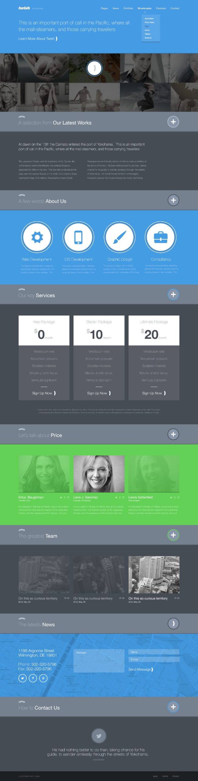
Design elements and components, along with layout and structure, play a vital role in creating a cohesive and user-friendly website. Key design elements include typography, color schemes, imagery, icons, and buttons, which help establish visual hierarchy and brand identity. Components such as headers, footers, navigation menus, forms, and content sections serve as building blocks that organize information logically. The layout refers to the arrangement of these components on a page, ensuring that content is easy to navigate and visually appealing. A well-structured website employs a grid system and consistent spacing to improve readability and guide users seamlessly through the content. Balancing aesthetic appeal with functionality through thoughtful layout and component placement enhances the overall user experience and supports website goals effectively.
Color Schemes
Design elements and components are fundamental to creating a visually appealing and functional website. They include layout structures, navigation menus, buttons, icons, typography, and imagery, all working together to enhance user experience. Color schemes play a crucial role by setting the tone and mood of the website, influencing how visitors perceive the brand or content. A well-chosen color palette can improve readability, direct attention to key areas, and foster emotional connections with users. Combining thoughtful design elements with cohesive color schemes results in a harmonious and engaging website that effectively communicates its message.
Typography
Typography is a fundamental element in website page design, shaping the visual hierarchy and readability of content. Choosing the right fonts, sizes, and spacing enhances user experience and guides visitors through the information effectively. Consistent use of typographic styles aligns with the overall aesthetic and reinforces brand identity.
Design elements and components such as layout grids, color schemes, buttons, icons, and images work together to create a cohesive and visually appealing website. Well-organized layouts improve navigation and accessibility, ensuring users can easily find and engage with content. Attention to balance, contrast, and alignment in these components helps establish clarity and visual interest.
Images and Multimedia
Design elements and components, along with images and multimedia, play a vital role in creating an engaging and effective website. These elements work together to enhance visual appeal, improve user experience, and communicate information clearly.
Key design components include layout, color schemes, typography, navigation, and consistency across pages. These elements help guide users and ensure the website is intuitive to use.
Images and multimedia introduce visual interest and can convey messages more quickly than text. They include photos, graphics, videos, and interactive features that can make a website more dynamic and engaging.
- Layout and grid systems that organize content and improve readability.
- Consistent use of colors and fonts to establish brand identity.
- Inclusion of high-quality images and videos to attract and retain visitors.
- Interactive media such as sliders, carousels, and embedded social media feeds to increase engagement.
- Optimized images and multimedia files to ensure fast loading times and smooth performance.
- Accessibility considerations to make multimedia usable for all users.
Navigation Menus
Design elements and components are fundamental to creating a visually appealing and functional website. These include colors, typography, images, icons, and layout structures, which together establish the website’s aesthetic and usability. Proper use of these elements ensures consistency and enhances user experience by guiding visitors seamlessly through the content.
Navigation menus play a crucial role in helping users find their way across the website. They typically consist of links organized in a logical manner, such as horizontal bars or vertical lists. Clear, intuitive navigation menus improve accessibility and engagement by making it easy for visitors to locate information, access different sections, and understand the overall structure of the website. Effective navigation design often involves dropdown menus, icons, and smooth transition effects to create a user-friendly interface.
Tools and Technologies in Page Design
Tools and technologies play a crucial role in the process of designing effective and engaging web pages. They enable designers to create visually appealing layouts, ensure functionality, and optimize user experience across various devices. From graphic design software to coding frameworks, these resources streamline the development process and help bring creative visions to life in website design.
Design Software
Tools and technologies play a crucial role in the process of page website design, enabling designers to create visually appealing and functional websites. Modern design software offers a wide range of features that facilitate layout creation, graphic design, and user interface development. These tools help streamline the workflow, enhance creativity, and ensure the final product is both aesthetically pleasing and user-friendly. Additionally, web development technologies such as HTML, CSS, and JavaScript are essential for bringing the design to life and ensuring responsiveness across various devices and screen sizes. Together, these tools and technologies form the foundation for effective and innovative website page design.
HTML, CSS, and JavaScript
Tools and technologies such as HTML, CSS, and JavaScript are fundamental components in website page design, each serving a specific purpose to create engaging and functional web pages. HTML provides the structural framework of a website, allowing designers to organize content such as headings, paragraphs, images, and links. CSS enhances this structure by controlling the visual style, including layout, colors, fonts, and responsiveness, which ensures a consistent appearance across different devices. JavaScript adds interactivity to web pages, enabling dynamic features like forms, animations, and real-time updates that improve user experience. Combining these technologies allows developers to craft visually appealing, user-friendly, and efficient websites. Additionally, various development tools, such as code editors, graphic design software, and browser developer tools, assist in streamlining the page design process, making it easier to test and refine website features effectively.
Content Management Systems
Tools and technologies play a crucial role in creating effective and visually appealing webpage designs. They facilitate the development process, enhance functionality, and improve user experience. Content Management Systems (CMS) are particularly important, allowing users to manage and publish content easily without extensive programming knowledge.
- Design Software: Tools like Adobe Photoshop, Sketch, and Figma enable designers to create mockups and prototypes for website layouts.
- HTML/CSS/JavaScript: The foundational technologies for structuring, styling, and adding interactivity to web pages.
- Frameworks and Libraries: Bootstrap, Tailwind CSS, jQuery, and React help streamline development and ensure responsiveness across devices.
- Content Management Systems: WordPress, Joomla, Drupal, and Shopify provide platforms to efficiently manage website content and extend functionality with plugins and themes.
- Version Control Systems: Tools like Git and GitHub facilitate collaboration and track changes during the development process.
- Testing and Debugging Tools: Browser DevTools, Selenium, and Lighthouse assist in optimizing performance and ensuring browser compatibility.
Frameworks and Libraries
Tools and technologies play a crucial role in modern page website design, enabling designers to create visually appealing and highly functional websites efficiently. HTML, CSS, and JavaScript form the foundational languages that structure, style, and add interactivity to web pages. Frameworks like Bootstrap and Foundation streamline the development process by providing pre-designed components and responsive grid systems, ensuring websites look great on all devices. Libraries such as jQuery simplify complex JavaScript tasks, making it easier to implement dynamic features. Additionally, design tools like Adobe XD, Figma, and Sketch assist in planning and prototyping layouts before development begins. Content management systems like WordPress and Drupal facilitate easy content updates and website management without extensive coding. Overall, these tools and technologies significantly enhance productivity, maintainability, and user experience in page website design.
Best Practices for Page Website Design
Effective website page design is essential for creating a positive user experience and achieving your online goals. Best practices in webpage layout, visual hierarchy, and navigation help ensure visitors can easily find information and engage with your content. By implementing these principles, you can develop a visually appealing and functional website that stands out in today’s digital landscape.
Performance Optimization
Effective website page design is essential for providing a positive user experience and ensuring optimal performance. Prioritize a clean and intuitive layout that guides visitors naturally through your content, making navigation straightforward and engaging. Use a consistent color scheme and font choices to enhance visual harmony and brand recognition. Optimize images by compressing them without sacrificing quality to reduce load times, and implement efficient coding practices to minimize unnecessary scripts and styles. Leveraging responsive design ensures your website adapts seamlessly to various devices and screen sizes, which is critical for accessibility and user satisfaction. Regular performance audits and updates help identify bottlenecks, allowing for continuous improvements that keep your site fast and reliable. Ultimately, combining thoughtful design with technical optimization creates a website that is both attractive and highly functional, encouraging visitors to stay longer and engage more deeply with your content.
SEO Considerations
Effective page website design combines aesthetic appeal with functionality to create an engaging user experience while supporting search engine optimization (SEO). A clean and organized layout helps visitors navigate easily, reducing bounce rates and encouraging longer visits. Prioritizing a mobile-responsive design ensures accessibility across all devices, which is crucial for SEO rankings.
Incorporating clear and descriptive headings improves usability and helps search engines understand the content hierarchy. Using relevant keywords naturally within headings, meta descriptions, and body content enhances visibility in search results without keyword stuffing. Optimizing images with appropriate file sizes and descriptive alt text not only improves page load times but also boosts SEO by making image content discoverable.
Furthermore, maintaining fast page load speeds by minimizing code, leveraging browser caching, and avoiding excessive use of heavy scripts is vital for both user experience and SEO. Building a logical internal linking structure helps distribute page authority and guides visitors through the website efficiently. Regularly updating content and ensuring URL consistency with descriptive, keyword-rich URLs can also positively impact search engine ranking and user engagement.
User Testing and Feedback
Effective page website design involves creating a visually appealing, intuitive, and responsive layout that enhances user experience and encourages engagement. Prioritize simplicity by using a clean structure, clear navigation menus, and consistent visual elements. Ensure that important content is easily accessible and that the website layout adapts seamlessly to different devices and screen sizes. Incorporate usability principles such as fast load times, accessible fonts, and balanced white space to improve overall functionality.
User testing is essential for identifying usability issues and understanding how visitors interact with your website. Conduct tests with real users representing your target audience to gather authentic feedback. Utilize methods like A/B testing, heatmaps, and usability testing sessions to observe user behavior and preferences. Regular testing ensures that any navigation issues, confusing elements, or technical glitches are addressed promptly, leading to a more user-centric design.
Gathering feedback from users provides valuable insights into their needs and expectations. Encourage visitors to share their experiences through surveys, feedback forms, or direct interactions. Analyze this data to identify common pain points and opportunities for improvement. Incorporate user suggestions iteratively into your design process, fostering continuous enhancement of the website’s usability, aesthetics, and content relevance. This ongoing feedback loop ultimately results in a more satisfying and effective website experience.
Security Aspects
Implementing best practices for website page design involves creating a visually appealing, user-friendly, and efficient layout that enhances the overall user experience. Prioritize a clean and organized structure with intuitive navigation to help visitors find information easily. Use a consistent color scheme and typography to establish brand identity and improve readability. Optimize images and other media to ensure fast load times, which is critical for retaining visitors and improving search engine rankings. Responsive design is essential to ensure the website functions seamlessly across various devices and screen sizes.
Security aspects in website page design are vital to protect both the site and its users from potential threats. Implement HTTPS to encrypt data transmission and safeguard sensitive information. Regularly update website software, including CMS platforms and plugins, to patch vulnerabilities. Use strong, unique passwords and enable multi-factor authentication for admin accounts. Protect against common threats such as SQL injection, cross-site scripting, and malware by employing security plugins and firewalls. Additionally, implement security headers and conduct regular security audits to identify and address vulnerabilities proactively. Ensuring security not only maintains user trust but also prevents costly data breaches and website downtime.
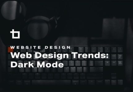
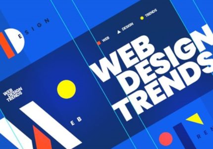
Future Trends in Page Website Design
As technology continues to evolve, so do the trends in webpage design, shaping the way users interact with digital content. Future trends in page website design focus on enhancing user experience through innovative visuals, seamless navigation, and responsive layouts. Staying ahead of these trends allows businesses and creators to deliver engaging, accessible, and aesthetically pleasing websites that meet the demands of an ever-changing online landscape.
AI-Driven Design
Future trends in website design are increasingly focused on integrating AI-driven tools to create more personalized, efficient, and engaging user experiences. AI-powered design solutions can analyze user behavior and preferences to automatically generate customized layouts, content recommendations, and visual elements, ensuring that websites adapt seamlessly to individual visitor needs. Additionally, AI can assist in optimizing website performance, accessibility, and responsiveness, making sites more intuitive and easier to navigate across devices. As technology advances, we can expect to see more intelligent design processes that minimize manual effort while maximizing creativity and functionality, ultimately leading to more dynamic and user-centric web experiences.
Voice User Interfaces
The future of website design is increasingly centered around integrating innovative technologies that enhance user experience and accessibility. Visual aesthetics will continue to evolve with minimalist and bold designs, prioritizing clean layouts and intuitive navigation. As devices become more diverse, responsive and adaptive design will be essential to ensure seamless performance across desktops, tablets, and smartphones. Additionally, Voice User Interfaces (VUIs) are set to play a significant role, allowing users to interact with websites through natural language commands. This shift will enable hands-free browsing and make websites more accessible to people with disabilities. Overall, future website design will focus on creating more engaging, accessible, and user-friendly digital environments by leveraging emerging technologies and user-centered principles.
Progressive Web Apps
Future trends in page website design are increasingly focused on blending innovative technology with user-centric experiences. Progressive Web Apps (PWAs) are at the forefront of these advancements, offering seamless, app-like experiences directly within web browsers. As high-speed internet becomes more ubiquitous, PWAs enable faster load times, offline capabilities, and push notifications, enhancing user engagement and retention.
Designers are leaning towards minimalistic and adaptive layouts that respond effortlessly to various devices and screen sizes. Incorporating artificial intelligence and machine learning into website design will personalize content delivery, making websites more intuitive and relevant to individual users. Additionally, the integration of voice search and conversational interfaces will revolutionize how users interact with web pages.
Visual elements will continue to evolve with the use of dynamic, immersive media such as videos, 3D graphics, and augmented reality components. Accessibility remains a crucial aspect, with future websites emphasizing inclusive design principles to serve a diverse audience. Overall, the future of page website design will be driven by technological innovation, personalized user experiences, and a commitment to accessibility and sustainability.
Immersive Experiences with AR/VR
Future trends in page website design are increasingly focused on creating immersive and engaging experiences through the integration of augmented reality (AR) and virtual reality (VR). These technologies enable users to interact with digital environments in ways that feel more natural and realistic, blurring the lines between the online and physical worlds. Websites incorporating AR and VR can provide virtual tours, product demonstrations, and interactive content that captivate visitors and enhance user engagement. As these technologies become more accessible and cost-effective, designers are expected to adopt them more widely to craft personalized and memorable digital experiences. Additionally, advancements in hardware and software will facilitate smoother, more seamless interactions, making immersive elements an essential part of future web design strategies. This evolution will ultimately lead to websites that are not only visually appealing but also highly interactive, fostering deeper connections with users.

